About Us
Our Work
Solutions
Ideas
About Us
Our Work
Solutions
Ideas
Careers
Contact & Locations
Danaher
Digikey
Nokia
Oportun
Dupont
NYC Pride
See all work
⟶
Build and revitalize brands
Unlock growth opportunities
Reimagine experiences
Drive marketing strategies
Create customer engagement
Inspire and empower employees
Series
PLAY: An AI Exploration
Please
enable cookies
to view this video
About Us
Our Work
Solutions
Ideas
Careers
Contact & Locations
회사 소개
주요 프로젝트
아이디어
회사 소개
주요 프로젝트
아이디어
채용
연락처 및 지점
Standard Chartered
Nokia
Dupont
모든 프로젝트 보기
⟶
관점
믿고 찾는 브랜드
회사 소개
주요 프로젝트
아이디어
채용
연락처 및 지점
Ideas
Cutting-edge brand, experience and marketing perspectives, shared by our diverse team of experts and partners.
Perspective
Go-to Brands: How to build a winning brand
Please
enable cookies
to view this video
Article
12 brand trends to watch in 2025
Please
enable cookies
to view this video
Podcast
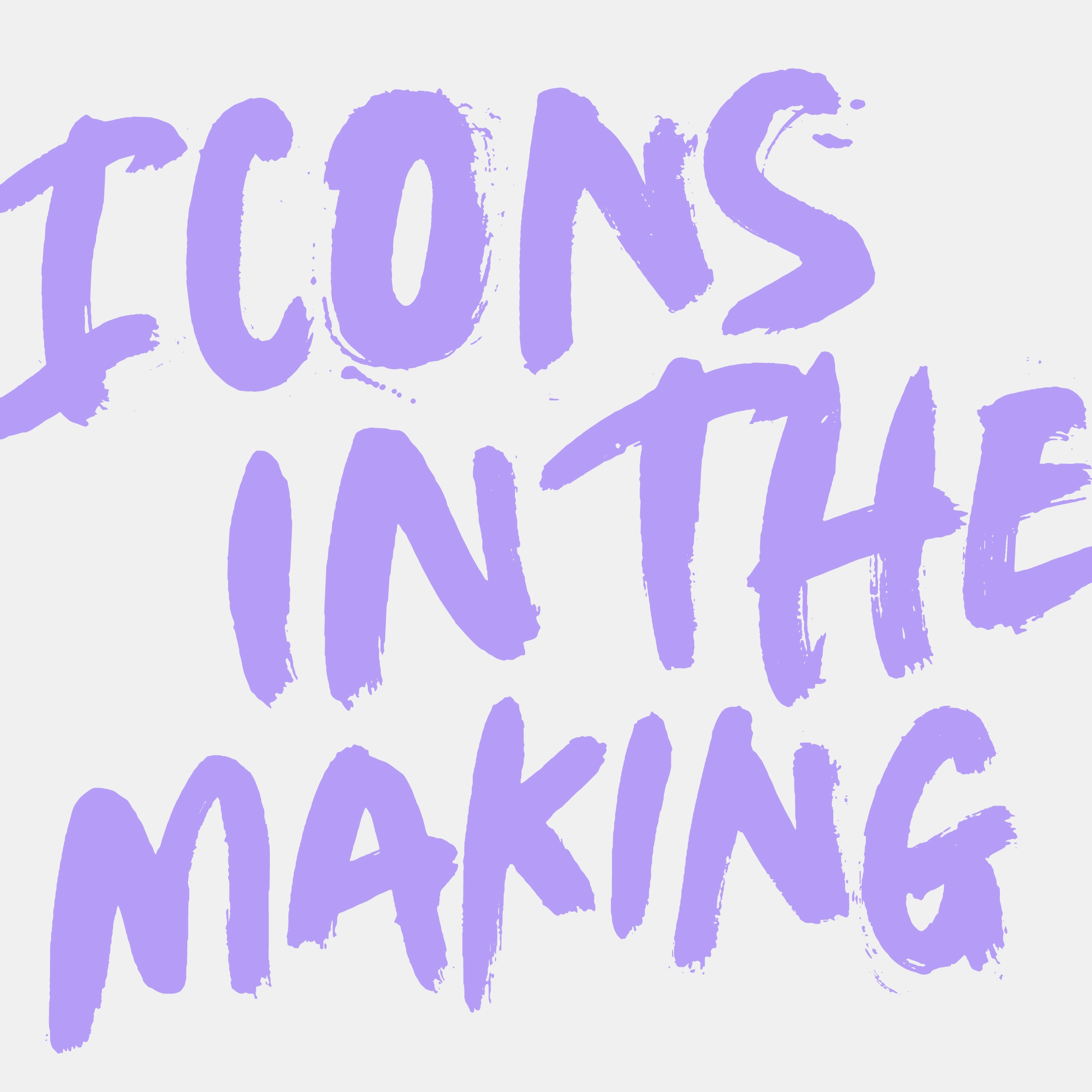
Icons in the Making
아이디어
다양한 전문가와 파트너로 구성된 당사 직원들이 제공하는 최신 인사이트와 고유한 관점.
관점
Go-To 브랜드: 성공하는 브랜드를 구축하는 방법
이 동영상을 보려면
쿠키를 활성화
하십시오.
콘텐츠 시리즈
재생: AI 탐험
이 동영상을 보려면
쿠키를 활성화
하십시오.
팟캐스트
제작 중인 아이콘
관점
Go-To 브랜드: 성공하는 브랜드를 구축하는 방법
관점
Brand Aperture®
관점
애자일 마스터브랜드
관점
업무 기반 혁신
Powered by GlobalLink Web