Southwest Airlines
사랑받는 브랜드의 중심에 우뚝서기
인간적인 평판과 40년 연속으로 증가해 온 수익성에도 불구하고 Southwest Airlines는 시장 경쟁과 압박에서 그다지 자유롭지 못했습니다.
Competitors have attempted to undercut them on price by unbundling services (and then charging for extras), and rivals have upped the ante with new services and technologies. Southwest saw an opportunity to develop a new brand identity for a new era, one that would build on its differentiators and set the business up for continued success.
Lippincott의 목표는 40년간의 성공 비결을 현대적이고 강렬한 룩에 담아내고 분리된 비주얼 시스템을 하나로 통합하여 주요 타깃층인 밀레니얼 세대와 비즈니스 여행객과 소통창구를 만듦으로써 Southwest를 리브랜딩하는 것이었습니다.
Uncovering the true differentiator
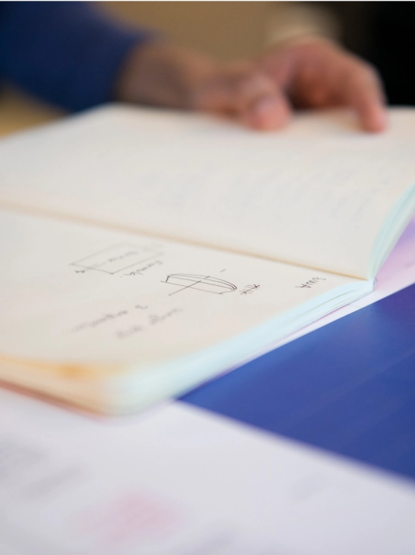
디자인 솔루션을 성공적으로 이끌기 위해서는 회사의 비전과 역사를 조화시켜야 했습니다. Southwest had long stood for freedom, but our research pointed to something deeper. 바로 Southwest가 항상 모든 승객을 동등하게 대우해 왔다는 점입니다. This led to the insight to focus on what makes the Southwest Airlines brand great: its emphasis on people first.
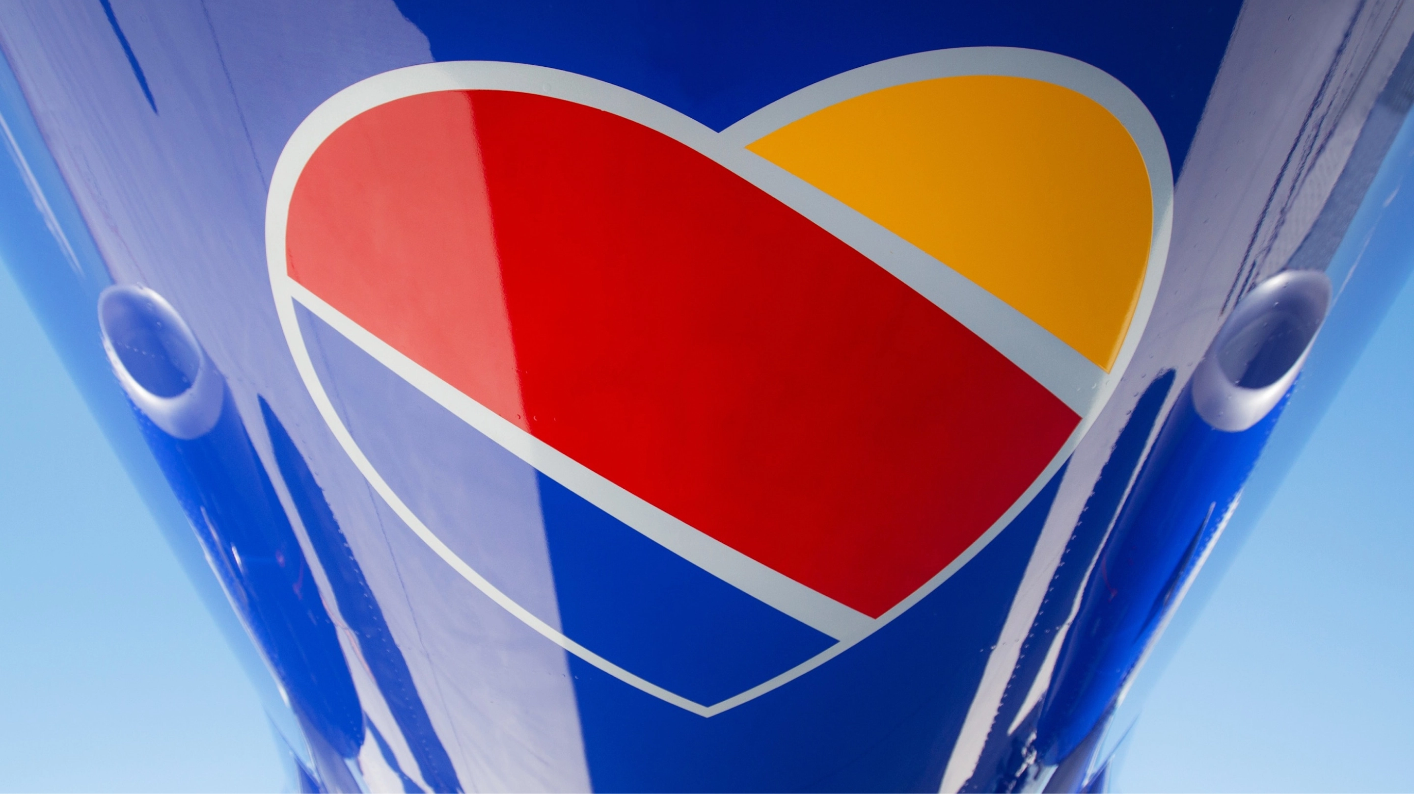
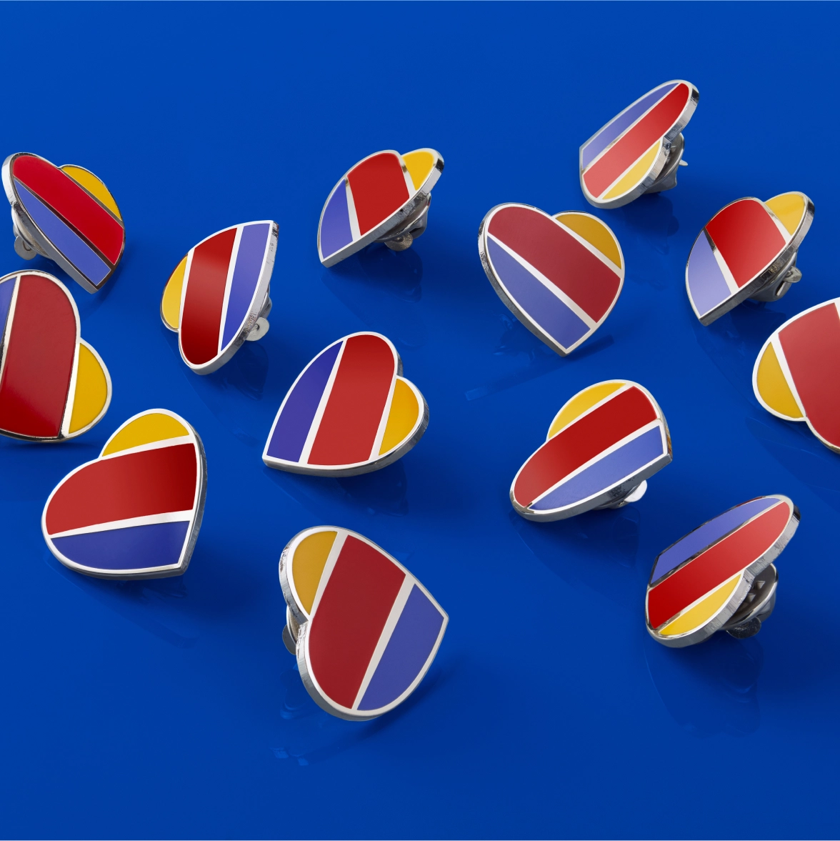
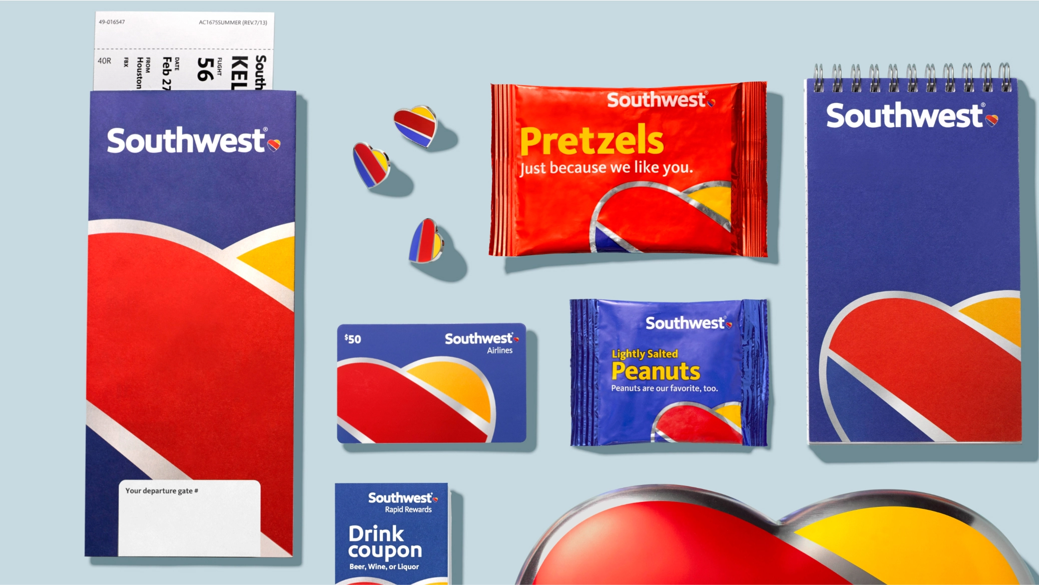
Breathing new life into a classic symbol
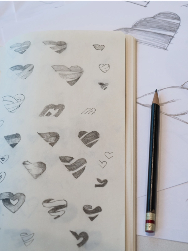
이러한 리서치에서 가장 강력한 상징적 자산이 하트라는 사실을 알아냈습니다. 하트는 항상 브랜드의 아이덴티티의 일부였지만, 수백 번의 변화를 겪으면서 과도하게 사용된 감이 있었습니다. Lippincott는 하트를 사용해 보다 의미 있는 메시지를 만들기로 했으며, 덕분에 하트는 진정한 상징적 기호가 되었습니다.
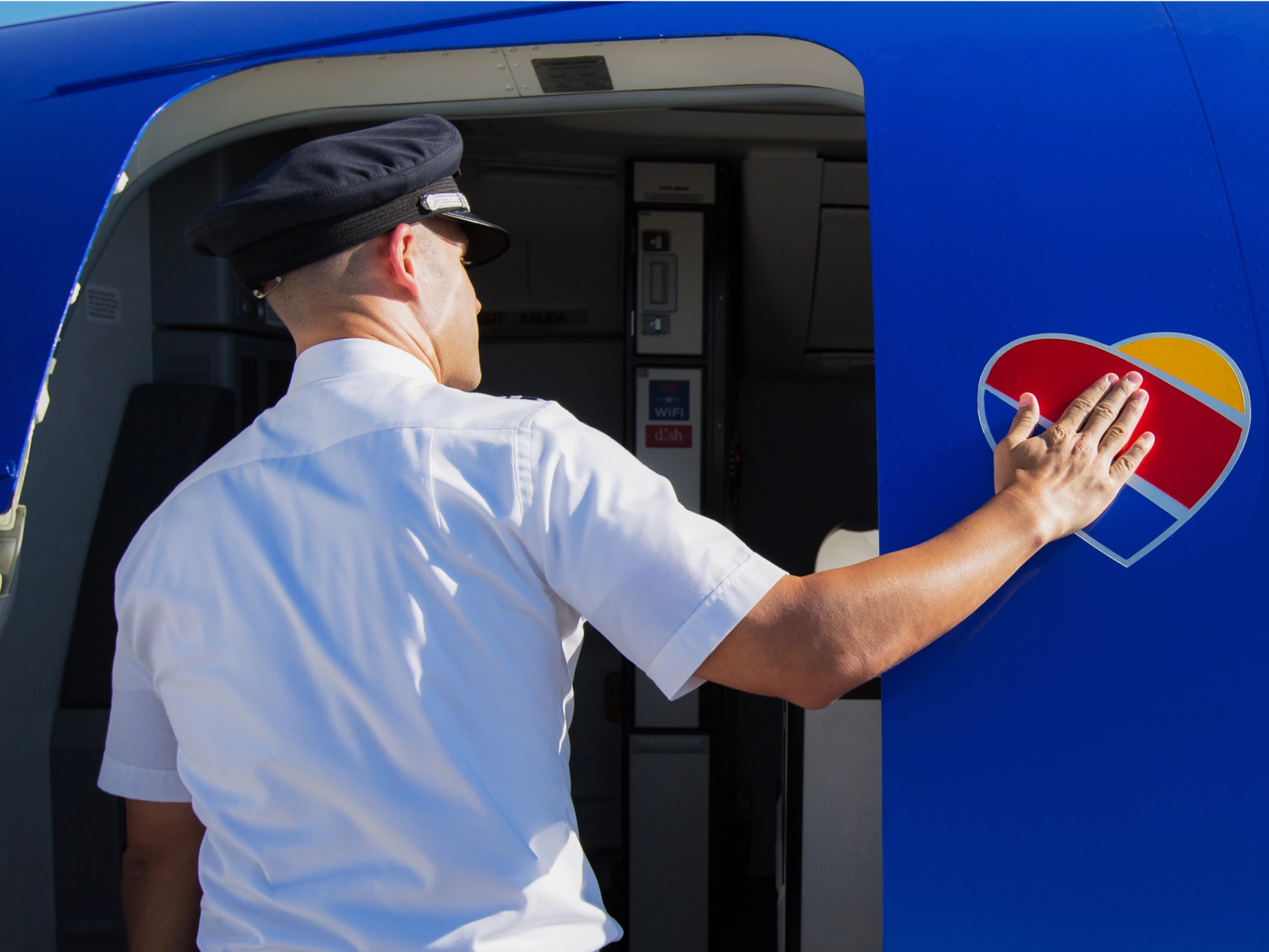
In 2014, Southwest claimed the humble but bold heart as its symbol, crystallizing a business philosophy 47 years in the making and showing the world that what started Southwest is exactly what will lead it into the future—treating people more like people.
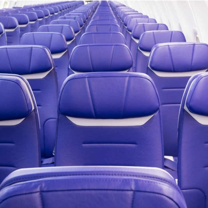
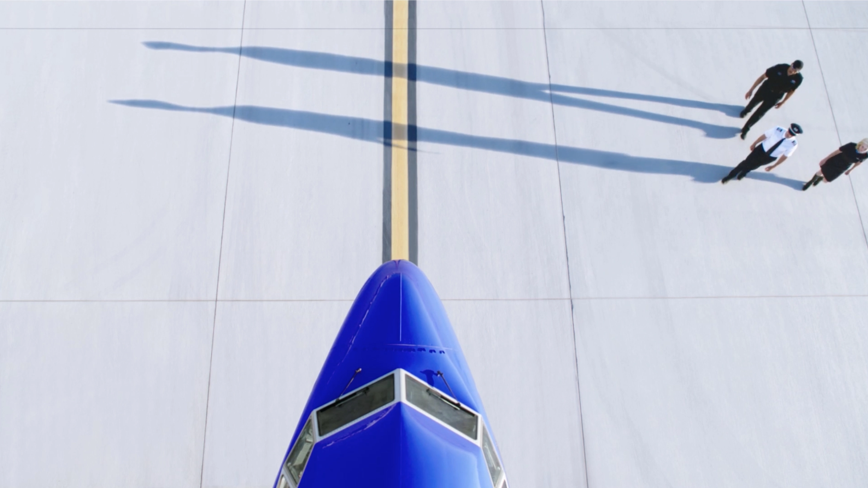
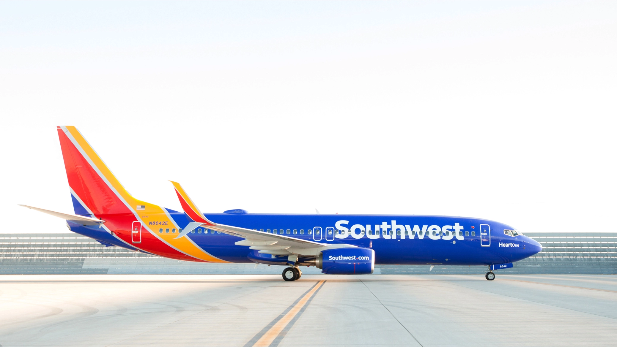
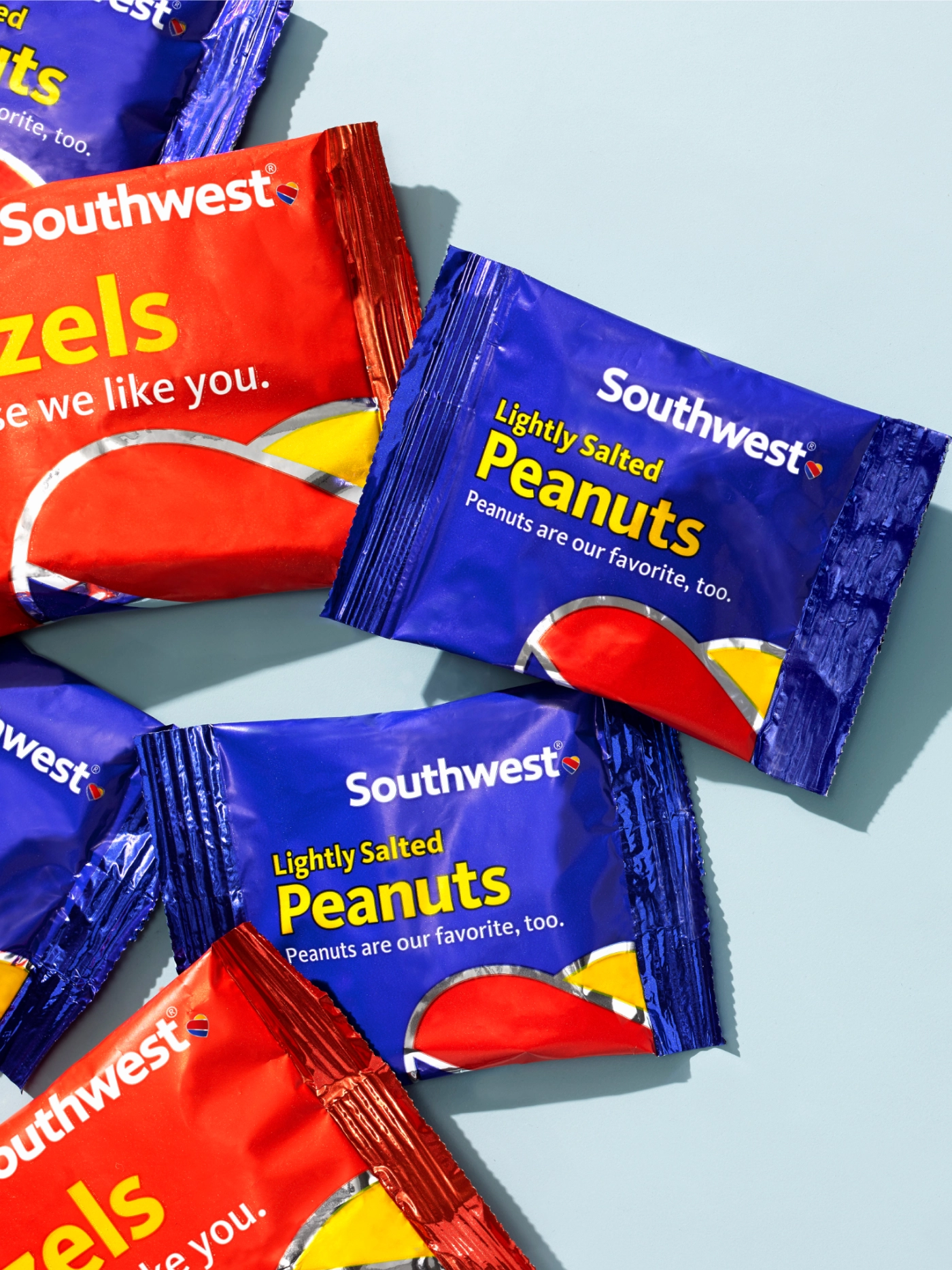
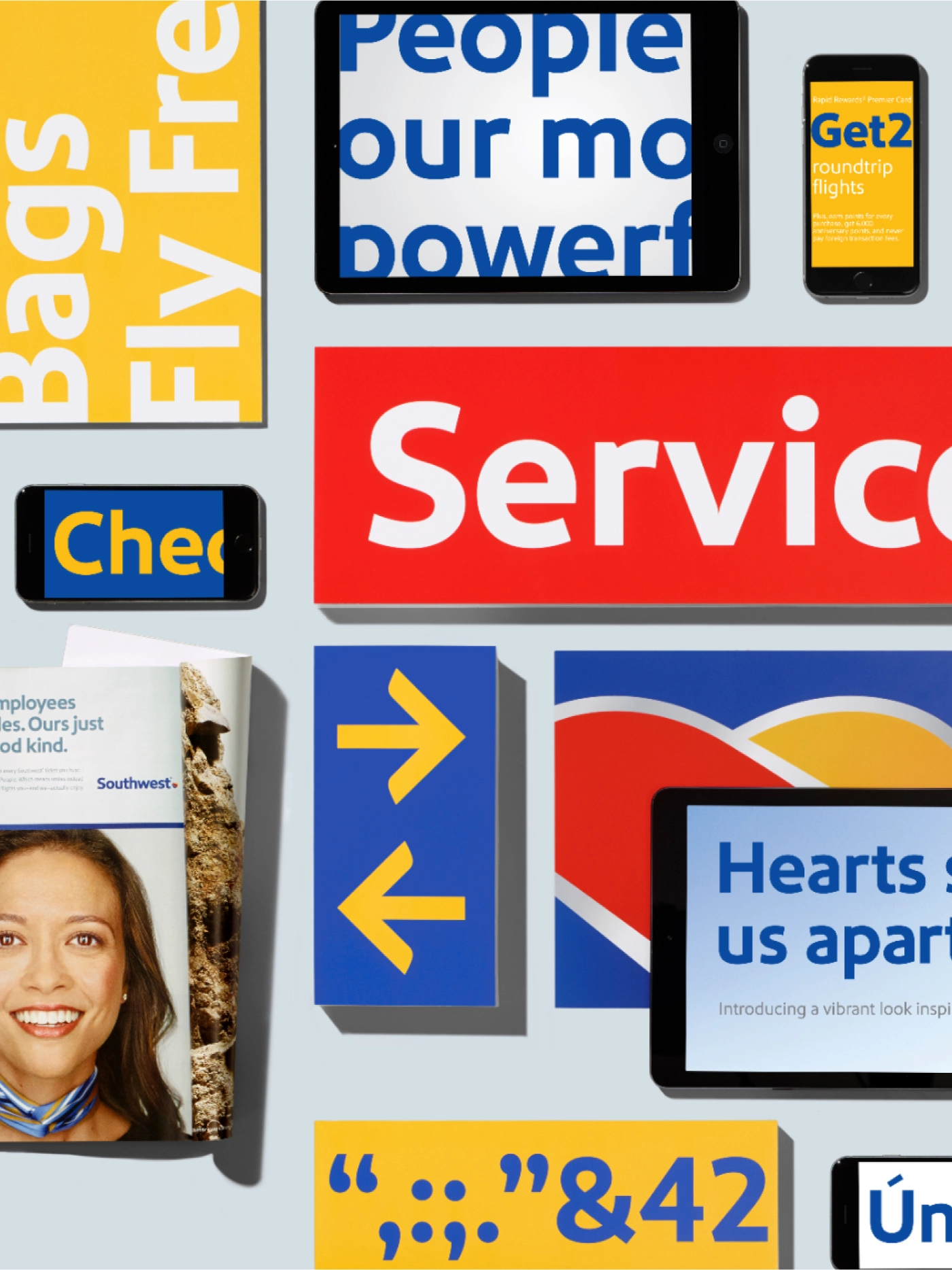
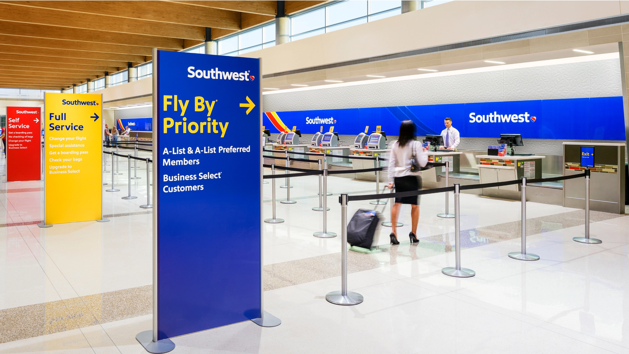
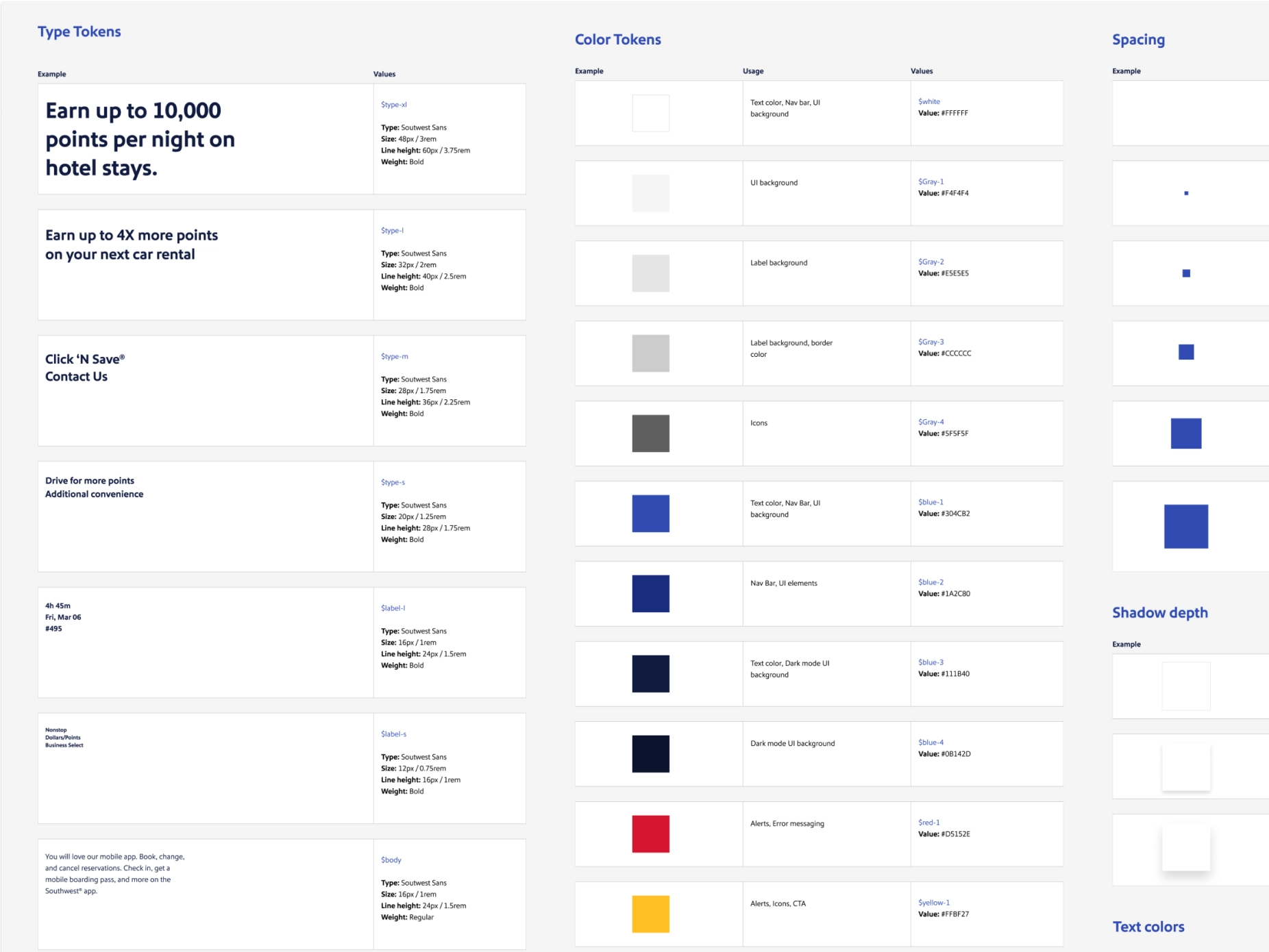
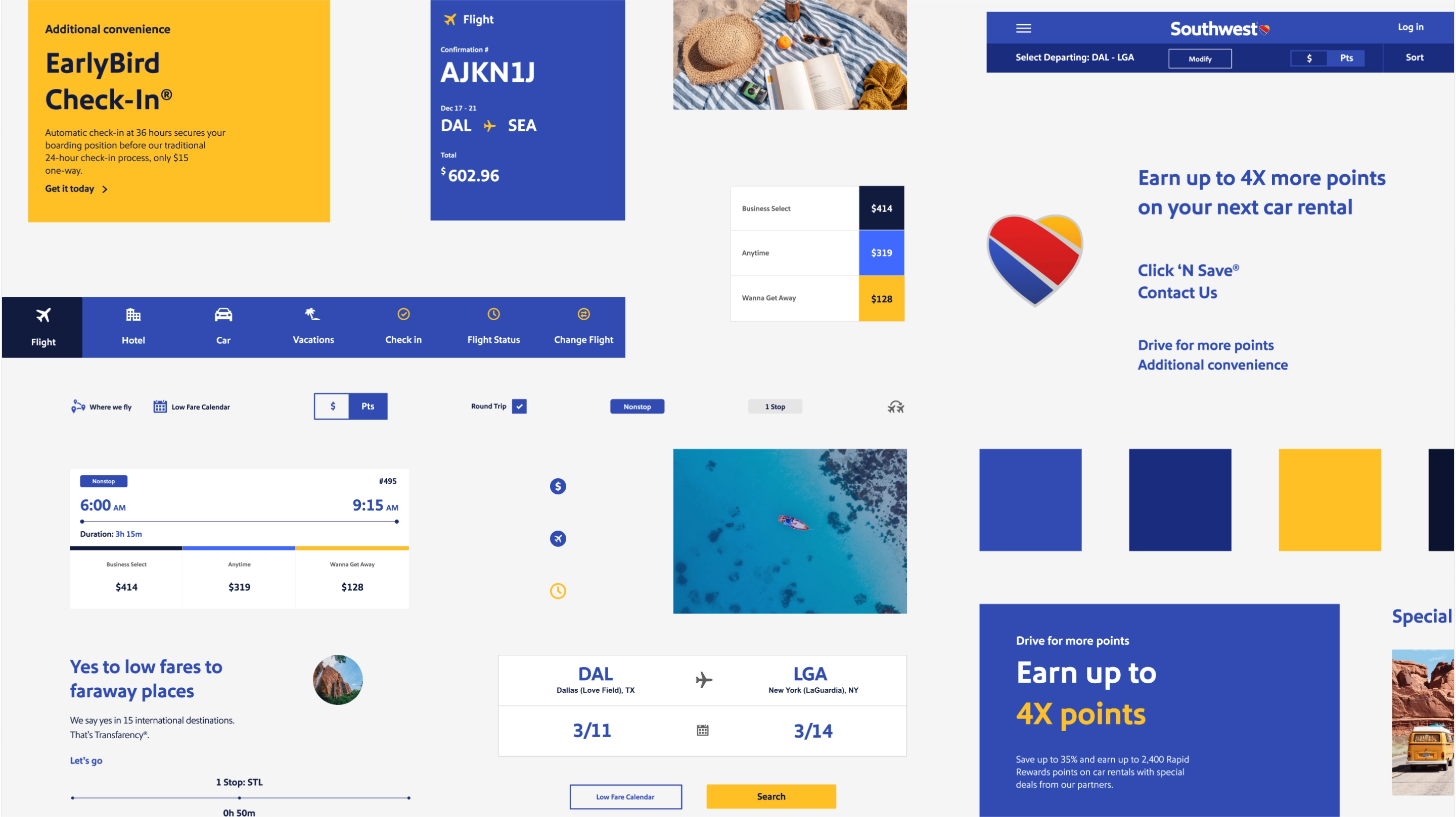
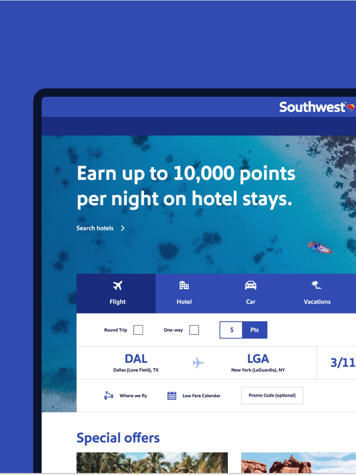
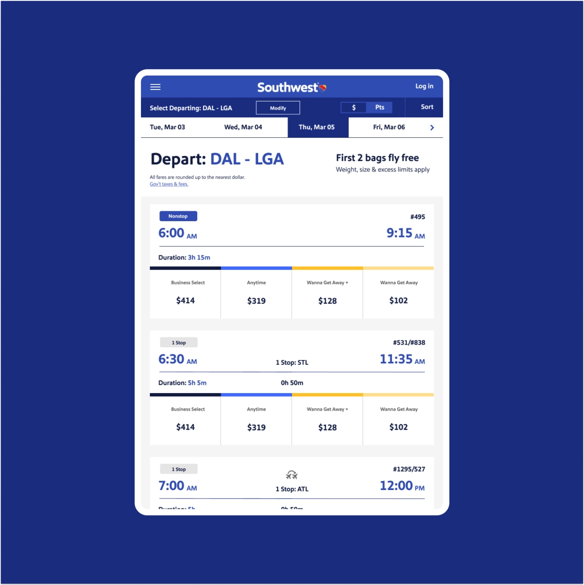
Building a visual system with heart
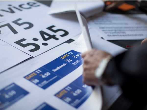
Complementing the new Southwest logo is a redesign of the brand’s livery, airports, and website. 여객기에서 스낵류 포장 디자인까지, 현대적이고 모던하면서도 confident, authentic, and full of personality.
"Southwest의 항공기에 선명하게 새겨져 있는 하트와 새로운 비주얼 시스템은 지속적으로 핵심 가치를 위해 진정성 있게 최선을 다하겠다는 대고객 약속을 상징합니다."
"개인적인 의견으로, 지난 수 년간 봐 온 항공사 디자인 리뉴얼 중 가장 혁신적이며 훌륭합니다. Southwest의 자부심이 느껴집니다. 회사가 리브랜딩 론칭에 이렇게까지 자부심을 가지는 것은 매우 드물고 어려운 일이죠."
Flying higher
Immediately following its evolution, it was blues skies for Southwest. The brand was named airline of the year and top investment pick of 2014. Not only did the airline have a 95 percent appeal to Southwest flyers, but it also saw a seven percent increase in consideration among business travelers as well as an increase in brand commitment among the general market.
Lippincott has continued to work with Southwest through the years to show that a little heart goes a long way, from creating a comprehensive UX design system to crafting a campaign for the brand’s 50th anniversary. 이러한 노력들을 통해 Southwest는 ‘사람을 최우선하는’ 더욱 특별한 항공사로 재탄생했습니다.